Vibrant Magenta Color Palette: Bold, Creative Brand Identity
Bold, creative, and expressive. A color that stands out and demands attention. Vibrant magenta combines the passionate energy of red with the sophisticated elegance of purple, creating a powerful hue for brands ready to make unforgettable impressions.
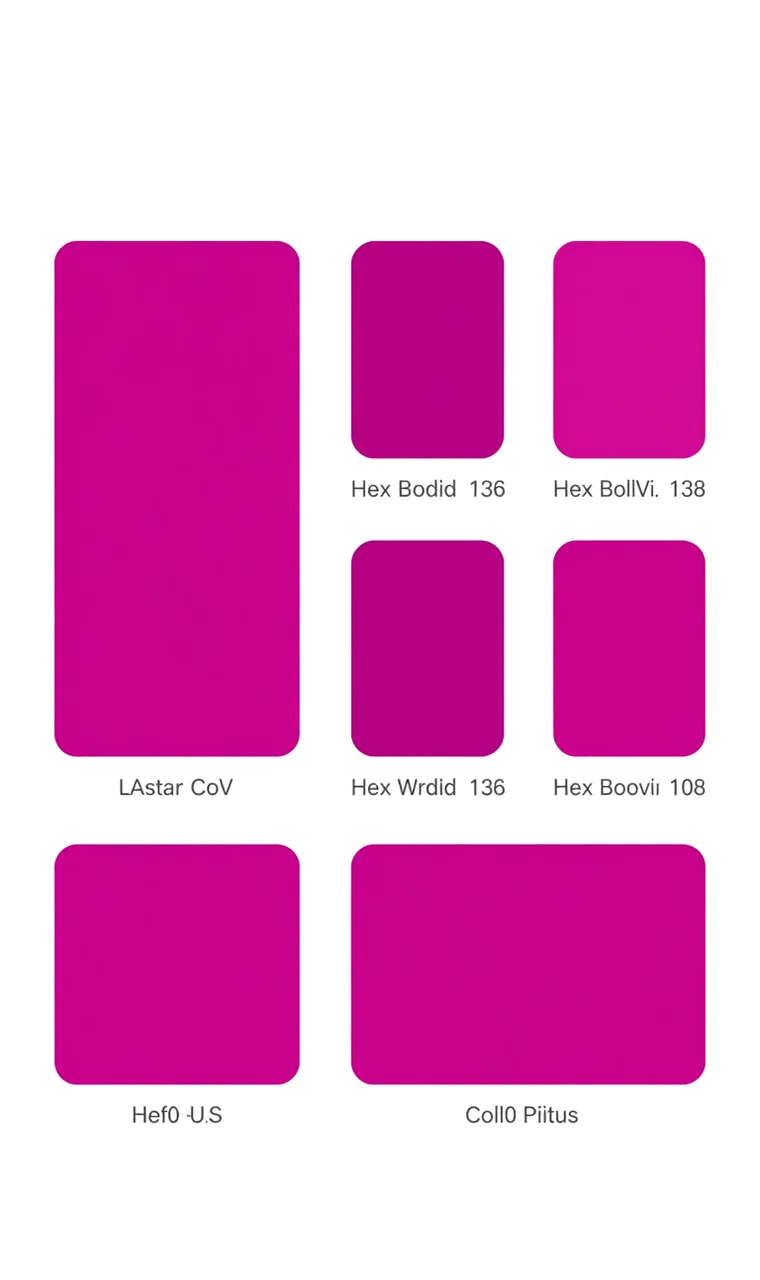
Color Palette
#C026D3
#D946EF
#E879F9
#F0ABFC
#FAE8FF
Color Psychology
Magenta combines the energy of red with the sophistication of purple. It's bold, creative, and unconventional. Magenta suggests originality and innovation, perfect for brands that want to stand out.
The Emotional Impact of Vibrant Magenta
Passion and Emotion: Deep red undertones evoke intensity and feeling, making magenta ideal for brands that want to create emotional connections with their audience.
Creativity and Imagination: Purple's influence connects to artistic expression and creative thinking, positioning magenta-using brands as innovative thought leaders.
Confidence and Boldness: The color's unapologetic brightness demonstrates self-assurance and fearlessness—brands using magenta signal they're not afraid to be different.
Modern Innovation: As a color that doesn't exist in the natural rainbow, magenta's synthetic origins suggest forward-thinking and technological advancement.
Non-Conformity: Magenta has traditionally been associated with counterculture and rebellion. Contemporary brands leverage this to position themselves as challengers to the status quo.
Best Industries
This color palette works exceptionally well for:
- Fashion
- Beauty
- Creative Services
- Media
- Entertainment
Usage Tips
- Use for creative and artistic brands
- Perfect for beauty products
- Works with dark backgrounds
- Great for fashion and style
Strategic Applications
Primary Brand Color: Use vibrant magenta as your main brand color for maximum impact. Works exceptionally well for logos, headlines, and key calls-to-action where you want to grab attention.
Accent Color: In more conservative brand systems, magenta serves as a powerful accent color. Even small touches—buttons, icons, highlights—can energize an otherwise neutral palette.
Gradient Design: Magenta creates stunning gradients with purple, pink, orange, and blue. Gradient backgrounds, typography, or UI elements can modernize your brand while maintaining color consistency.
Seasonal Campaigns: Magenta's association with creativity and confidence makes it perfect for product launches, creative campaigns, or innovation-focused initiatives.
Complementary Colors
#00D9FF
#84CC16
#FF6B6B
Winning Color Combinations
Magenta + Charcoal Grey: High-contrast sophistication that works beautifully for tech, fashion, and design brands. The dark neutral lets magenta shine while maintaining professionalism.
Magenta + Gold: Luxury glamour that elevates magenta's natural confidence. Perfect for beauty, fashion, and premium lifestyle brands.
Magenta + Mint Green: Fresh, modern energy that feels contemporary and approachable. Great for health, wellness, and lifestyle brands targeting younger demographics.
Magenta + Navy Blue: Professional creativity that balances magenta's playfulness with navy's trustworthiness. Ideal for creative agencies, consulting firms, and B2B companies.
Magenta + White: Clean, bold minimalism that relies on generous white space to maintain sophistication. Works across all industries when executed with restraint.
Why This Palette Works
The Vibrant Magenta palette creates bold, creative, and expressive brand identities. A color that stands out and demands attention, magenta combines the energy of red with the sophistication of purple. It's bold, creative, and unconventional—magenta suggests originality and innovation, perfect for brands that want to stand out.
In crowded marketplaces, vibrant magenta cuts through visual noise and creates memorable impressions. Brands using this color demonstrate confidence in their identity and willingness to challenge conventions.
Brand Applications
Logo Design: Create memorable logos with Vibrant Magenta that capture attention and communicate creativity. The color's strength ensures logo recognition even at small sizes.
Website Design: Build engaging, energetic interfaces with this palette. Use magenta strategically for CTAs, navigation highlights, and key interactive elements to guide user attention.
Marketing Materials: Design professional marketing assets that stand out. Magenta's energy works beautifully for social media graphics, email campaigns, and print materials where you want to create impact.
Product Packaging: Stand out on shelves with Vibrant Magenta packaging that demands attention. The color's boldness ensures products don't get lost among competitors.
Digital Products: Apps, software, and digital platforms can use magenta to create energetic, modern user experiences that feel innovative and user-friendly.
Pairing Suggestions
Minimalist logo designs pair exceptionally well with Vibrant Magenta colors, creating sophisticated contrast that lets both the color and the logo shine. For complementary aesthetics, explore Creative Purple, Energetic Red, or Growth Green for related color palettes that create harmonious brand systems.
Case Studies: Vibrant Magenta in Action
Cosmetics Brands: High-end beauty companies use magenta to communicate glamour, creativity, and confidence. The color flatters diverse skin tones in product photography while standing out on vanity tables.
Tech Startups: Innovative technology companies leverage magenta's modern, synthetic associations to position themselves as forward-thinking and disruptive. The color signals creativity and technological advancement.
Design Agencies: Creative studios use magenta to demonstrate their design sensibilities and attract clients seeking bold, innovative work. The color serves as a portfolio piece in itself.
Fashion Retailers: Trend-focused fashion brands employ magenta to communicate style consciousness and creative expression. The color works beautifully for both fast fashion and luxury positioning.
FAQ: Vibrant Magenta Branding
Is vibrant magenta too bold for professional brands?
Not necessarily. While traditionally associated with creative industries, professional service companies can successfully use magenta as an accent color or in specific campaigns to demonstrate innovation and approachability. The key is balance and strategic placement.
Does vibrant magenta work for B2B branding?
Yes, particularly in creative, tech, and consulting sectors where differentiation from conservative competitors is valuable. Use magenta strategically—perhaps in logos, website accents, or marketing materials—while maintaining professionalism through typography and layout.
How do I prevent magenta from overwhelming my brand design?
Balance magenta with generous white or neutral space. Follow the 60-30-10 rule: 60% neutral colors (white, grey, black), 30% secondary colors, and 10% vibrant magenta accents. This creates sophisticated palettes that pop without chaos.
What demographics respond best to vibrant magenta?
Magenta appeals broadly but resonates particularly strongly with women, creative professionals, and younger demographics (Gen Z and millennials) seeking brands that value self-expression and innovation.
Can magenta work in minimalist brand design?
Absolutely. Minimalist magenta branding uses color as a focal point against clean white backgrounds and simple, elegant typography. Think Apple's design language but with strategic magenta accents that create visual interest without clutter.
How does vibrant magenta perform in digital vs. print?
Magenta translates beautifully to digital screens, where RGB displays enhance its vibrancy and create eye-catching digital experiences. In print, careful color management ensures consistency—CMYK conversions can sometimes dull magenta's intensity, so work with experienced printers and consider spot colors for critical applications.
What colors clash with magenta?
Avoid pairing magenta with other highly saturated warm colors like bright orange or red, which can create visual chaos. Brown and certain greens can also create unappealing combinations. Stick to complementary colors (blues, greens), neutrals (whites, greys, blacks), or sophisticated metallics (gold, silver) for best results.
Related Color Palettes
Trust Blue
Why it fits: Similar aesthetic appeal
Energetic Red
Why it fits: Similar aesthetic appeal
Growth Green
Why it fits: Similar aesthetic appeal
Creative Purple
Why it fits: Similar aesthetic appeal
Warm Orange
Why it fits: Similar aesthetic appeal
Sophisticated Black
Why it fits: Similar aesthetic appeal