Warm Orange Color Palette: Friendly, Energetic Brand Identity
Friendly, enthusiastic, and confident. Creates energy and warmth. Warm orange sits at the intersection of red's energy and yellow's happiness, creating a versatile hue that communicates enthusiasm and approachability without red's aggression or yellow's intensity.
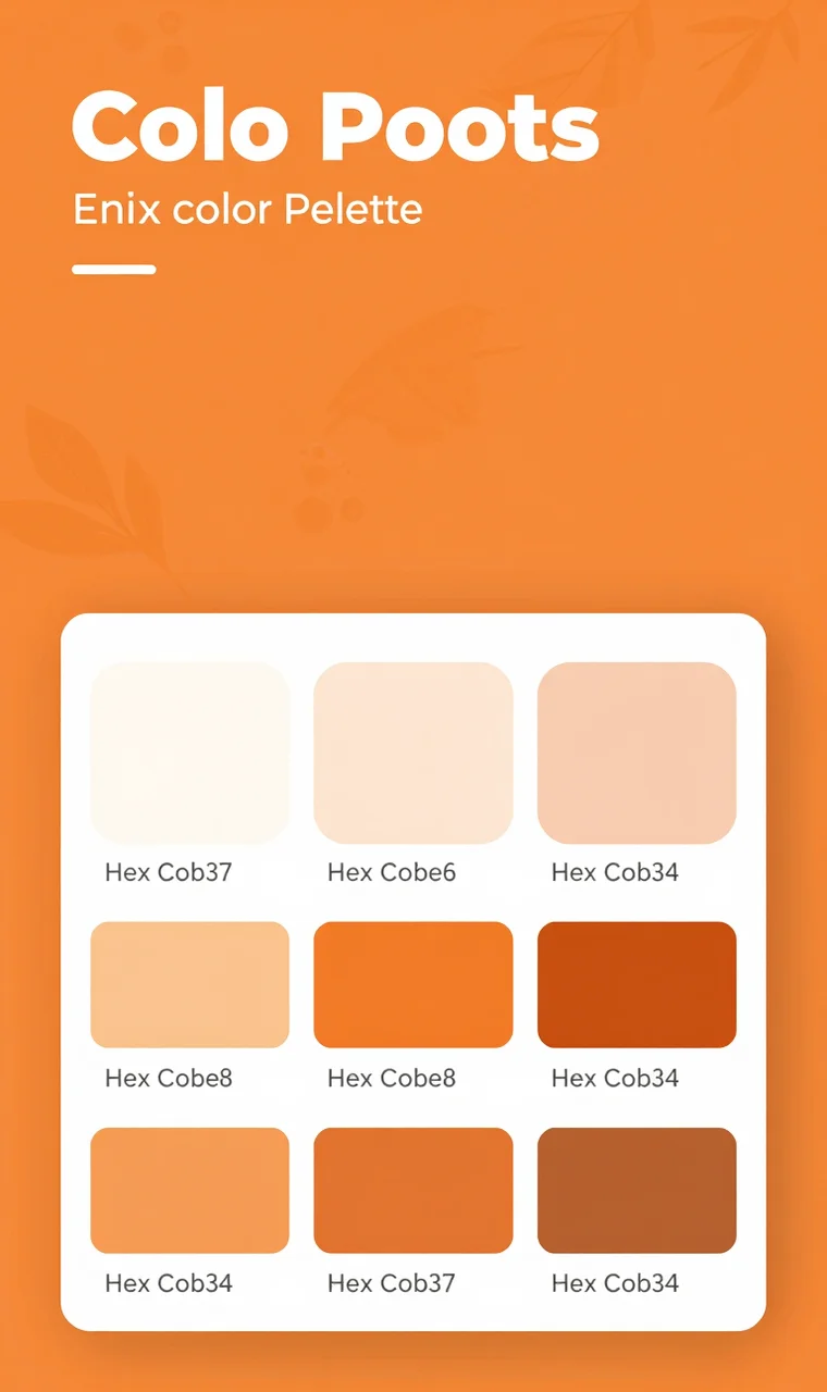
Color Palette
#EA580C
#F97316
#FB923C
#FDBA74
#FFEDD5
Color Psychology
Orange combines the energy of red with the happiness of yellow. It's friendly, confident, and enthusiastic. Great for brands that want to appear approachable without being too aggressive.
The Emotional Impact of Warm Orange
Enthusiasm and Energy: Orange motivates action and creates excitement without red's urgency. It's the color of motivation and momentum.
Friendliness and Approachability: Unlike aggressive red or intense yellow, orange feels welcoming and inclusive. Brands using orange appear more accessible and down-to-earth.
Confidence and Ambition: Orange signals brands that know their worth and aren't afraid to stand out. It conveys healthy confidence without arrogance.
Youthfulness and Fun: Orange's playful energy connects to inner child and joy, making it perfect for brands targeting younger demographics or promoting fun experiences.
Creativity and Innovation: As a less common brand color than blue or red, orange demonstrates originality and willingness to be different.
Practicality and Reliability: Hardware stores and home improvement brands have successfully claimed orange, associating it with can-do practicality and helpful service.
Best Industries
This color palette works exceptionally well for:
- Food & Beverage
- Youth Products
- E-commerce
- Entertainment
- Sports
Usage Tips
- Excellent for call-to-action buttons
- Use to create friendly vibe
- Works well with dark blues
- Perfect for youthful brands
Strategic Applications
Call-to-Action Optimization: Orange CTAs frequently outperform other colors due to their energetic, action-oriented psychology without red's aggressiveness. Test orange for buttons, signup forms, and promotional elements.
Accent Color Strategy: Use orange as an energetic accent in predominantly neutral palettes. Orange highlights, icons, or graphical elements create visual interest and guide attention without overwhelming.
E-commerce Enhancement: Retail and e-commerce brands leverage orange's association with action and enthusiasm to drive purchases. Orange sale badges, checkout buttons, and promotional banners create urgency and motivation.
Brand Warmth: Professional service companies can use orange to add warmth and approachability to otherwise serious brands. Law firms, financial services, and healthcare providers can incorporate orange in subtle ways that humanize their brand.
Complementary Colors
#1E3A8A
#065F46
#7C2D12
Winning Color Combinations
Orange + Navy Blue: Classic, energetic sophistication that works beautifully across virtually all industries. The deep blue provides professionalism while orange adds energy and accessibility.
Orange + Charcoal Grey: Modern, high-contrast appeal that feels contemporary and confident. Tech companies and startups often use this combination to appear innovative yet grounded.
Orange + Teal: Fresh, complementary energy that feels vibrant and modern. The blue-green tones cool orange's warmth while maintaining energetic appeal.
Orange + White: Clean, friendly minimalism that relies on generous white space to maintain sophistication. Works across all industries when executed with proper restraint.
Orange + Dark Brown: Earthy, grounded warmth that feels natural and authentic. Great for food, organic, and outdoor lifestyle brands.
Orange + Gold: Premium warmth that elevates orange's friendly energy into luxury territory. Sophisticated enough for premium brands seeking approachability.
Why This Palette Works
The Warm Orange palette creates friendly, enthusiastic, and confident brand identities. It creates energy and warmth—orange combines the energy of red with the happiness of yellow. It's friendly, confident, and enthusiastic, making it great for brands that want to appear approachable without being too aggressive.
In competitive markets, warm orange stands out while feeling welcoming rather than intimidating. Brands using this color demonstrate enthusiasm, confidence, and genuine desire to connect with their audience.
Brand Applications
Logo Design: Create memorable logos with Warm Orange that capture attention and communicate approachability. The color's friendliness ensures logos feel inviting rather than aggressive.
Website Design: Build engaging, user-friendly interfaces with this palette. Use orange strategically for CTAs, interactive elements, and highlights to guide user attention and create energetic experiences.
Marketing Materials: Design professional marketing assets that stand out. Orange's energy works beautifully for direct mail, social media graphics, and advertising campaigns where you want to create enthusiasm.
Product Packaging: Stand out on shelves with Warm Orange packaging that attracts attention and communicates friendly energy. The color works exceptionally well for food products, household items, and consumer goods.
Digital Products: Apps, software, and SaaS platforms can use orange to create approachable, energetic user experiences that feel modern and user-friendly. Orange reduces intimidation in technical products.
Physical Spaces: Retail stores, restaurants, and offices can incorporate orange through signage, accents, and branding elements to create welcoming, energetic environments.
Pairing Suggestions
Playful logo designs pair exceptionally well with Warm Orange colors, creating energetic, fun brand identities. For complementary aesthetics, explore Energetic Red, Vibrant Magenta, or Growth Green for related color palettes that create harmonious brand systems.
Case Studies: Warm Orange in Action
Amazon: The world's largest retailer uses orange in their logo and throughout their interface to communicate friendly, accessible service. Orange smiley arrows suggest happiness and forward motion.
Nickelodeon: The children's network employs orange as their signature color, perfectly capturing the energy, fun, and playfulness of their programming and brand personality.
HubSpot: The marketing and sales platform uses orange to make B2B software feel friendly and approachable. Their orange branding humanizes technical products and differentiates from corporate competitors.
Home Depot: The home improvement giant claimed orange as their signature color, associating it with practicality, helpful service, and can-do attitude. Orange aprons and branding make home improvement feel accessible.
Burger King: The fast-food chain uses warm orange alongside red to stimulate appetite and create energetic, fun brand experiences that appeal to families and younger demographics.
FAQ: Warm Orange Branding
Is warm orange too informal for professional brands?
Not inherently. While orange feels friendlier than navy or black, professional brands successfully use orange to add warmth and humanity. Law firms, financial services, and consulting companies can incorporate orange as an accent color that makes them feel more approachable without sacrificing professionalism.
Does warm orange work in B2B branding?
Yes, particularly for B2B companies wanting to appear innovative and accessible. SaaS companies, marketing agencies, and modern professional services successfully use orange to differentiate from conservative, blue-dominated competitors.
How does warm orange affect conversion rates?
Orange often increases conversion rates for calls-to-action due to its energetic, action-oriented psychology. The color creates urgency and motivation without red's aggressiveness. However, always A/B test—audience, context, and surrounding design significantly impact performance.
Can warm orange work for luxury brands?
Unconventional but possible. Luxury brands can use orange—particularly deeper, burnt orange or coral shades—paired with premium materials, elegant typography, and sophisticated design to create distinctive luxury positioning that feels confident rather than mass-market.
What demographics respond best to warm orange?
Orange appeals broadly but resonates particularly strongly with children, families, younger demographics, and value-conscious consumers seeking brands that feel accessible and down-to-earth rather than elitist.
How do I choose the right orange shade?
Consider your brand personality: Bright orange (#FFA500) for high energy and playfulness, burnt orange (#CC5500) for sophistication and earthiness, peach or coral (#FF7F50) for gentler warmth, or deep persimmon (#FF6347) for balanced energy. Test shades against your brand values and target audience preferences.
Does warm orange work across all cultures?
Orange generally has positive associations globally, though specific meanings vary. Western cultures associate orange with energy, autumn, and affordability. In Hinduism and Buddhism, orange represents spirituality and renunciation. Dutch culture uses orange for national pride. Research your target markets' specific color associations.
How does warm orange perform in accessibility?
Orange text on white backgrounds often fails WCAG contrast requirements. Use orange for large text, graphical elements, buttons, or backgrounds with dark text. Always test color contrast ratios and consider darker orange shades for text-critical applications. Orange works exceptionally well as a background color with white text or iconography.
Related Color Palettes
Trust Blue
Why it fits: Similar aesthetic appeal
Energetic Red
Why it fits: Similar aesthetic appeal
Growth Green
Why it fits: Similar aesthetic appeal
Creative Purple
Why it fits: Similar aesthetic appeal
Sophisticated Black
Why it fits: Similar aesthetic appeal
Calming Teal
Why it fits: Similar aesthetic appeal